CASE STUDY | PRODUCT DESIGN + RESEARCH

HGAPS Website Redesign

Helping Give Away Psychological Science is a nonprofit mental health resource organization. Our team studied its Assessment Center, where users could take free and confidential mental health assessments, and redesigned key parts of the experience to make the path clearer, less intimidating, and easier to understand.

RoleProduct Designer / Researcher
TimelineAug 2023 - Nov 2023
ScopeTeam project for HGAPS Assessment Center
HGAPS Assessment Center redesign screenshot shown on a laptop mockup
Problem Users had to work too hard to find, understand, and complete assessments.
Goal Increase confidence, reduce confusion, and help more users reach the right assessment path.

CONTEXT

A mental health site has to feel clear before it can feel useful.

Challenge

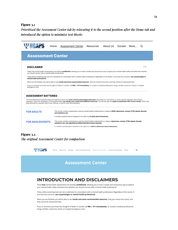
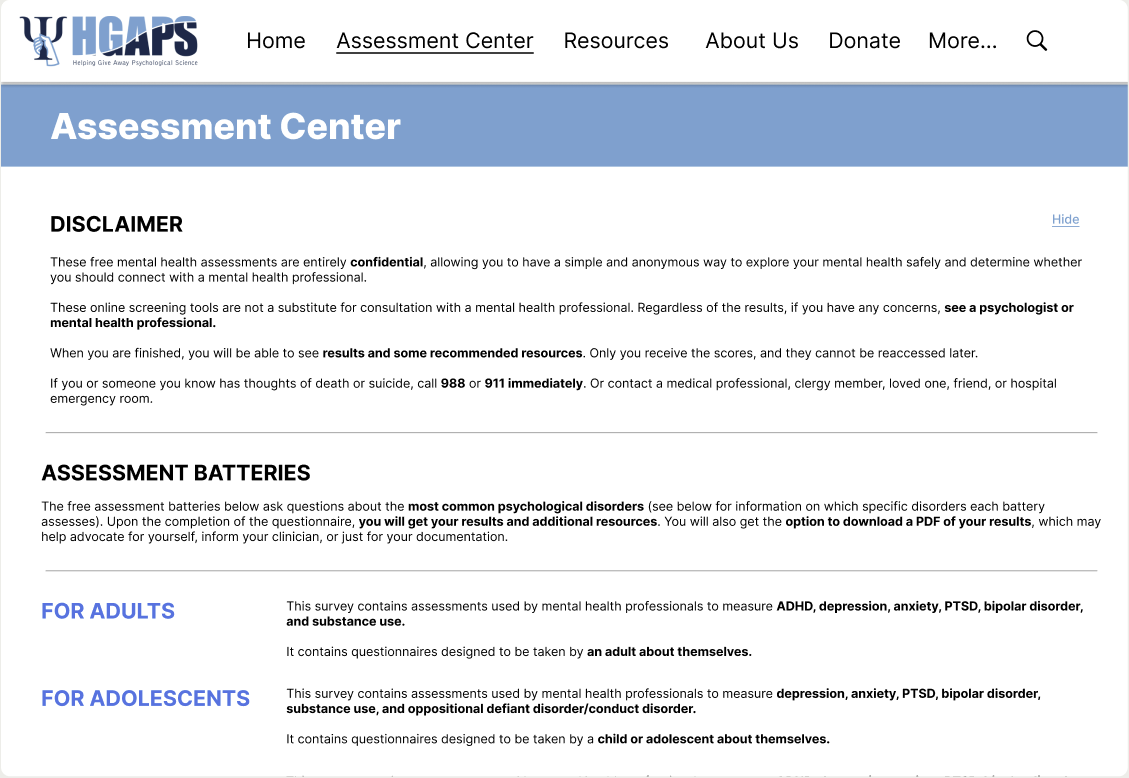
High-stakes information, low tolerance for confusion.

The Assessment Center asked users to move through introductions, demographic questions, assessment batteries, results, and resources. In a mental health context, unclear language and hard-to-find paths can quickly make users feel overwhelmed or uncertain.

My role

I focused on research, synthesis, and prototype recommendations.

I conducted structured user interviews and usability reviews, synthesized findings, designed Figma prototype recommendations, and contributed research-backed design direction for the Assessment Center experience.

Product goals

Because the redesign was not shipped, I framed impact as measurable goals.

The client received the recommendations positively, but the design has not been implemented yet. If shipped, I would evaluate success through assessment start rate, assessment completion rate, navigation success, user confidence, and satisfaction with the clarity of results and resources.

RESEARCH

What I looked for.

01

Navigation friction

I looked for moments where users hesitated, missed the Assessment Center, or were unsure which assessment path matched their needs.

02

Language barriers

The research surfaced clinical terms and acronyms, including words like "batteries," that could confuse users without a medical background.

03

Accessibility and trust

I paid attention to inconsistent formatting, link styling, dense text blocks, result readability, and resources that could affect user confidence in HGAPS.

HGAPS website data affinity model notes from the final specification
Website-level affinity notes helped separate general design issues from Assessment Center-specific problems.
HGAPS Assessment Center wording and accessibility affinity model notes
Assessment wording and accessibility notes pointed directly toward clearer language, consistent formatting, and better user feedback.

SYNTHESIS

The biggest pattern was not one broken page. It was cumulative effort.

Pain points

Users needed clearer cues.

Our findings pointed to clinical jargon, inconsistent page design, difficult-to-understand results, and resource concerns. Individually, each issue was manageable. Together, they made the experience feel harder than it needed to be.

Design direction

Reduce ambiguity before adding more content.

Instead of treating the redesign as decoration, I focused on the practical signals users needed: clearer tab placement, more consistent links, simpler text blocks, better distinction between assessment paths, and less redundant content.

HGAPS summary of pain points and recommendation table
The pain-point summary clarified the main design targets: jargon, inconsistent interface patterns, confusing results, and resource trust.

PROTOTYPE

Turning findings into interface decisions.

HGAPS Assessment Center redesign compared with the original page
Prioritized the Assessment Center tab and introduced collapsible text to reduce visual clutter.
HGAPS hyperlink and assessment path redesign compared with the original page
Made links more consistent and clarified the difference between survey and page destinations.
HGAPS simplified Assessment Center lower page with feedback and new measure sections
Removed redundant resources and simplified feedback and contribution sections to reduce clutter.

RECOMMENDATIONS

What I helped recommend.

01

Clarify wayfinding

Move the Assessment Center higher in the navigation and make it easier for users to identify the right path.

02

Reduce jargon

Replace or explain clinical terms and acronyms so users without a medical background can understand what they are choosing.

03

Strengthen consistency

Use more predictable link styling, cleaner page formatting, and simplified content blocks to make the site easier to scan.

HGAPS visioning session effort versus impact matrix
The visioning matrix helped frame recommendations by effort and impact, making the final direction easier to prioritize.

FULL REPORT

Read the complete HGAPS final specification.

If the embedded PDF does not load in your browser, open the full report.

REFLECTION

This project taught me that clarity is a form of care.

HGAPS was not just an exercise in making pages look cleaner. It was a lesson in designing for people who may already be carrying stress, uncertainty, or urgency. My part of the work was to listen for friction, turn those observations into patterns, and help translate the research into a calmer, more understandable product experience.

Back to portfolio