Find the right class, compare options, and avoid schedule mistakes.
The student goal was not just to search faster. It was to understand whether a section fit their time, location, seat availability, and plan before committing to enrollment.
CASE STUDY | PRODUCT DESIGN + IA
A high-fidelity prototype for a cleaner university course registration experience, focused on search, comparison, visual hierarchy, and confident enrollment decisions.
THE PROBLEM
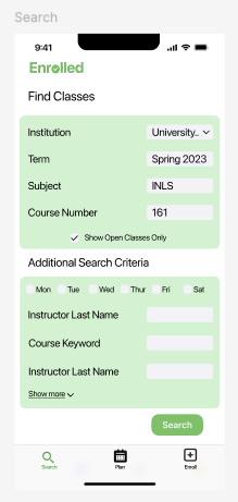
Students need to search by institution, term, subject, course number, instructor, keyword, open seats, and meeting days, then compare sections against their schedule before enrolling. My goal was to make that path feel more organized and less stressful without removing the detail students need to make a good decision.
The student goal was not just to search faster. It was to understand whether a section fit their time, location, seat availability, and plan before committing to enrollment.
If implemented, I would evaluate task completion rate, time to find a viable section, error rate when adding classes, confidence before enrollment, and satisfaction with the planning workflow.
MY CONTRIBUTION
I created high-fidelity Figma screens, applied color, typography, and information architecture principles, then used usability feedback to iterate on clarity. The prototype focuses on helping students narrow options, compare course sections, build a plan, and understand enrollment status before committing.
Grouped required fields and optional filters so students can start broad, then refine by day, instructor, keyword, and open classes.
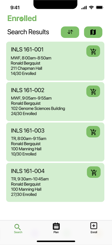
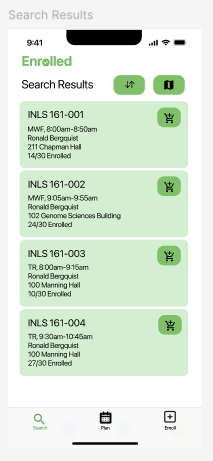
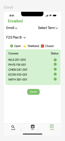
Designed result cards that surface section, schedule, instructor, location, and status details before students add a course.
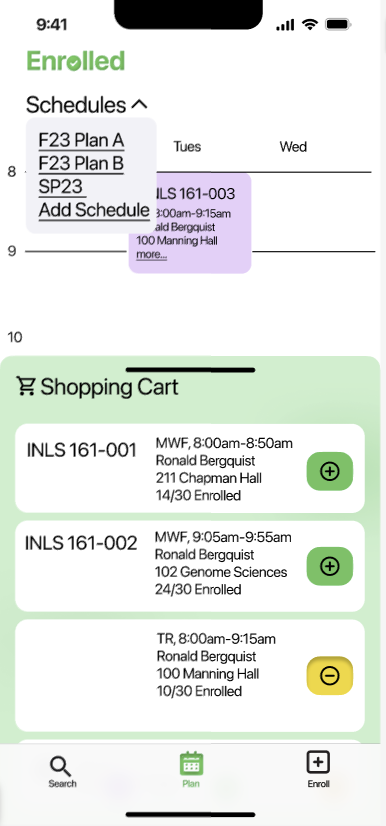
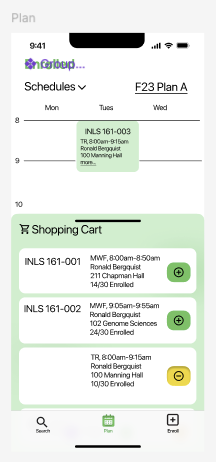
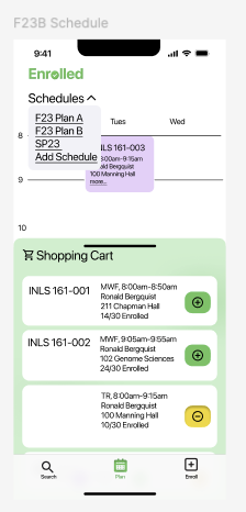
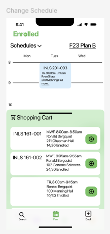
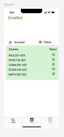
Connected the plan, shopping cart, and final enrollment screens so students can see what is selected and what still needs action.
DESIGN DECISIONS
The search screen keeps core inputs visible first, while additional criteria and day filters help reduce irrelevant results.
Green actions, large page titles, and card-based results create a clearer path through search, planning, and enrollment.
Schedule views, cart states, and enrollment checks make the system feel more like a guided workflow than a list of disconnected pages.
KEY SCREENS
Since the original interactive prototype is not available to share, these screens show the main flow and the interface decisions behind it.
OUTCOME
Enrolled helped me practice turning a messy institutional workflow into a more approachable product experience. The project strengthened my ability to organize information, prototype realistic mobile flows, and use feedback to make screens clearer.
Back to portfolio